Posted by Megan Hoffman - May 25, 2024
Hans Hoffman, one of the most important artists of postwar America, once said that “Design is the intermediary between information and understanding.”
Hoffman describes the designer’s challenge: to convey specific information that the public understands using creativity and imagination. This can be especially tricky when it comes to logo design.
A logo is the face of a brand: what people see first before they see the products or services of the brand and what they use to determine if the brand is a good fit for their needs. So how do you know if the logo you have or the one you need to design is effective and up to par? Here are 10 tips to guide you to an effective, creative logo.
The point of a logo is to stand out and differentiate your brand from others in the same industry. The question is, how do you differentiate your brand from the others?
The answer is research, research, research. Look at other popular brands in the industry and compare them to each other:
Once you get an idea of what your competitors are sporting, you can figure out how to make your brand pop out.
It seems like an obvious tip, but it’s an important step to mention, nonetheless.
Sketching is a helpful and useful way to get all those ideas swirling around in your head on paper, quicker than trying to create a dozen finished logos. Seeing your ideas sketched out can help you determine if they are a feasible option for the logo.
Once you sketch out some thumbnails, you can develop some roughs for the sketches that you think are the most promising. From there, you can upload the roughs into Adobe and create the comps to send to the client.
Bonus Tip: Thumbnails vs. Roughs vs. Comps
Thumbnails are small, quick, undetailed sketches. Usually, you can fit a dozen or so on a page, depending on the topic.
Roughs are slightly more detailed than sketches, usually a basic outline. Body copy, headlines, or pictures are usually not included, only where they will appear on the page.
Creation of Comprehensions (aka comps) are even more detailed roughs that include the body texts, titles, fonts, etc. as they would be displayed on the finished product. These are often what’s sent to the client for approval.
Example of Thumbnails
Icons are a great way to get your brand’s message across effectively, whether they’re embedded into the words or can stand alone without the brand name.
The Amazon logo, for example, tells the viewer that they sell everything from A to Z with an arrow that points from one to the other.
So, when you’re sketching, try some both with and without – get creative and have fun with it! But make sure the logo makes sense to use for the brand.
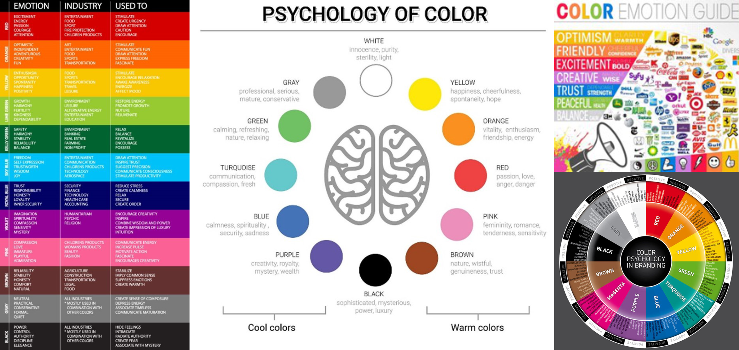
Using color in your design increases the chances of catching potential customers eyes because it’s bright and stands out.
Colors are also a great way to incite emotions, so a quick look into color psychology could be helpful for knowing how to grab a customer’s interest.
Below are some helpful quick reference guides to use when considering the colors for a brand or logo.

Though they sound similar, readability and legibility are, in fact, two different things.
Readability is defined as an arrangement of fonts and words in order to make written content flow smoothly and simply.
Legibility is how easily distinguishable letters in a typesetting or font are from one another.
In other words, if you have to squint your eyes or move the page at weird angles to read the information, you should probably find some different fonts to use.
Bonus Tip: Font Categories
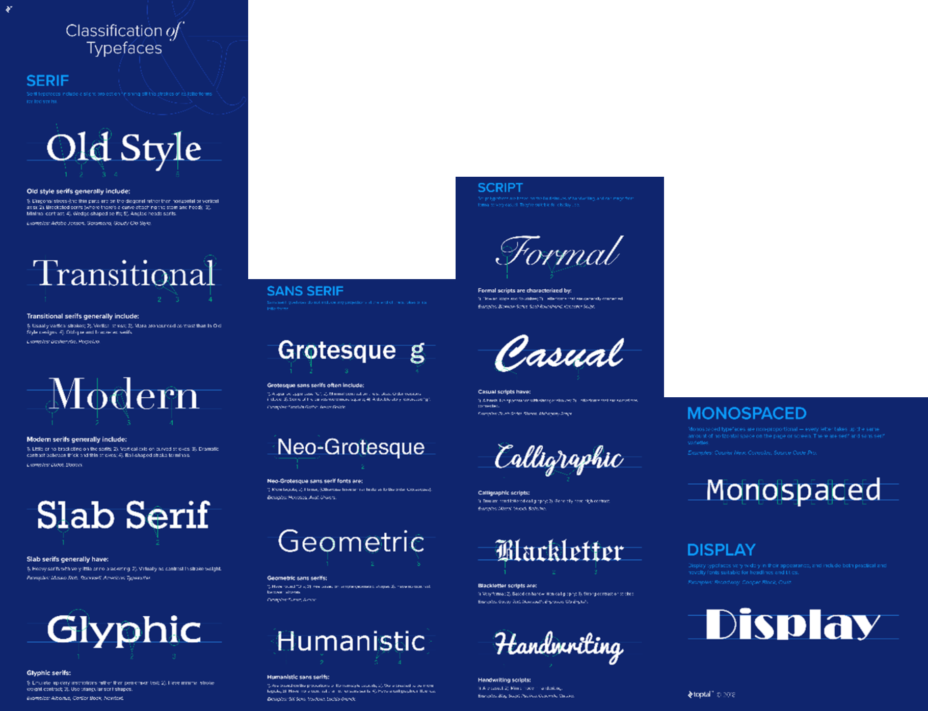
It’s better to stick to only 1-2 different fonts.
If you’re using 1, you can play around within the font family to use different styles. If you decide to use 2 fonts, it’s ideal to pick two different categories of fonts.
For instance, if you go with a cursive or handwritten font for the main logo, choosing a serif font for the tag line will help each stand on its own and ensure the viewer can read them.
There are many different categories of fonts and it would be worth a deep dive look. Otherwise, here is a quick reference guide.
Utilize white space around your logo. Give enough space between elements within the logo so that it doesn’t look cluttered or illegible. However, you don’t want too much white space because you want your logo to look like a single, cohesive element.
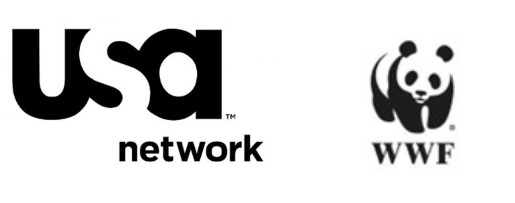
Utilizing the whitespace directly within the logo is also a unique way to stand out. Specifically, using the Gestalt Principle of Closure, which is the idea that your brain will fill in the missing parts of a design or image to create a whole.
Good examples of the Closure principle are the logos for USA Network and the World Wildlife Fund. Both logos use the black space to create the illusion of images in the white space.
To learn more about Gestalt Principles of Perception, check out the article “Exploring the Gestalt Principles of Design.”
Your logo should look good both on a small and large scale because you will be putting it on everything from business cards, to packaging, to T-shirts.
Icons and letters that are super detailed may not be a good idea for a logo since the smaller the scale, the more the details start to melt into each other.
Just as designs should be scalable, they should also look good both with and without color.
There may be times when you need your logo to be present, but not necessarily be the most visible element. That’s when you can turn to black & white instead of full color.
Though it can be difficult to tell what will withstand the test of time, aiming for a logo that does will be worth it in the long haul.
To achieve timelessness, you should avoid current fads and trends because those only last for so long. You also want to design something that will forever represent your brand.
Timeless logos should not have to change drastically to keep up with the world. They should be able to make minimal adjustments to “fit” into the current times. Moreso, they should be able to stick to their brand’s essence no matter the adjustments made.
Some good examples of timeless logos are shown here with Apple's VW's and Barbie's logo evolution.
This seems like a duh tip, but it’s still important to point out. This also brings us full circle back to tip #1.
You remember the brands and the logos that don’t blend into the background; the ones that are obviously different than their competitors.
As stated in tip #1, you need to research your competitors to figure out how to stand apart from them. In simple terms, you must be different to be remembered.
There you have it, 10 tips to help you on your journey into logo design.
Logo design doesn’t have to be hard or complicated. By using the 10 tips above as a guide, you will be able to create a perfect logo for your business.
Nonetheless, it can still be a headache when trying to apply all the tips yourself. Reaching out to a professional designer to help bring your ideas to life is always the best way to go.
Plain Insane Graphix has designers standing by, waiting and happy to help you with your logo design.
Visit pigdesigns.com or call (559) 924-6000 to talk to a designer today about how we can help save you the headache.
Are you looking for more ideas, inspiration, or information about marking tools? Join our mailing list to get regular updates to our marketing blog, newsletter and blogs.
Plain Insane Graphix was voted best graphic and print shop in Kings County for 2022 and 2023. Serving Lemoore, Hanford, Corcoran, Coalinga, Visalia, parts of Tulare County and Fresno County.

